MANILA, Dec. 7 (PNA)—Pantone, the world-renowned authority on color, has revealed for the first time two colors of the year for 2016.
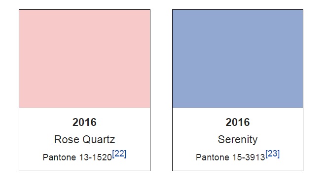
Let’s bid farewell to 2015’s wine red Marsala (18-1438) and embrace the softer side of 2016’s colors of Rose Quartz (13-1520) and Serenity (15-3919), which will be prevalent in fashion, design, furniture, and everything in between.
According to the color authorities of Pantone, the blending of Rose Quartz and Serenity “brings calm and relaxation” which can be appealing to customers who seek an antidote to modern day stresses.
“Joined together, Rose Quartz and Serenity demonstrate an inherent balance between a warmer embracing rose tone and the cooler tranquil blue, reflecting connection and wellness as well as a soothing sense of order and peace,” said Executive Director of Pantone Color Institute, Leatrice Eiseman.
Pantone noted that Rose Quartz conveys “compassion” and a “sense of composure” with its persuasive yet gentle tone.
Meanwhile, Serenity brings “feelings of respite and relaxation” even in turbulent times with its weightless and airy nature, akin to the expansive blue sky above.
Aside from the calm and relaxation the colors bring, the blending of the two shades disrupts conventions about color association by promoting gender fluidity.
Many parts of the world have reduced the sexual divide by blurring gender lines in fashion, which also caused ripples throughout all other areas of design with its impact on color trends, thereby muddling the demarcation between conventionally feminine and masculine colors.
“This more unilateral approach to color is coinciding with societal movements toward gender equality and fluidity, the consumer’s increased comfort with using color as a form of expression, a generation that has less concern about being typecast or judged and an open exchange of digital information that has opened our eyes to different approaches to color usage,” Pantone said in a statement.
Annually, Pantone names a particular “Color of the Year”, which is determined through a secret meeting of representatives from various nations’ color standards groups.
Colors chosen by Pantone in previous years were 2000’s Cerulean, 2001’s Fuschia Rose, 2002’s True Red, 2003’s Aqua Sky, 2004’s Tigerlily, 2005’s Blue Turquoise, 2006’s Sand Dollar, 2007’s Chili Pepper, 2008’s Blue Iris, 2009’s Mimosa, 2010’s Turquoise, 2011’s Honeysuckle, 2012’s Tangerine Tango, 2013’s Emerald, 2014’s Radiant Orchid, and 2015’s Marsala. (PNA)