Technology
Google refines logo as it prepares to join Alphabet
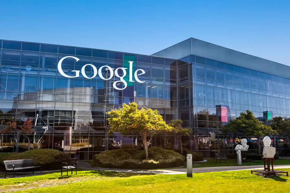
SAN FRANCISCO – Google is refining its famous logo as it prepares to become a part of a new holding company called Alphabet.
The revised design unveiled Tuesday features the same mix of blue, red, yellow and green that Google has been using throughout its nearly 17-year history, though the hues are slightly different shades.
Google also invented a new typeface called “Product Sans” that is meant to resemble the simple printing in a grade-school book. It will replace a serif typeface that Google has been using in its logo for more than 16 years. The “e” in the company’s name will remain slightly tilted to reflect Google’s sometimes off-kilter thinking.
Although this will be the sixth time that Google has changed its logo since Larry Page and Sergey Brin formed the company, this marks the most noticeable redesign since it dropped an exclamation point that appeared after its name until May 1999.
“I am sure this is going to upset a lot of people because everyone freaks out when a company like this makes a shift like this,” said Wally Krantz, executive creative director at brand consultants Landor. Krantz, though, applauded the change because he believes it gives the company a “fresh” look.
Google is donning the different look as it embarks on a new era.
The Mountain View, California, company is pouring so much money into so many far-flung projects that have little or no connection to its main business of online search and advertising that it’s getting ready to place everything under the Alphabet umbrella.
Under this setup, Google will retain search, YouTube and most of the biggest divisions while smaller operations such as Nest home appliances, life sciences, drone deliveries and venture capital investments will operate as individual companies. All will be overseen by Alphabet, whose CEO will be the Google co-founder Page.
Alphabet hasn’t revealed what its logo will be yet, but the holding company isn’t expected to be officially operating for a few more months.
Google believes its new logo will provide a more versatile identity suited “for a world of seamless computing across an endless number of devices,” the company said in a Tuesday blog post.
The overhaul also will change the appearance of the letter “g” that Google uses as its shorthand logo on the smaller screens of smartphones and other mobile devices.
The “g” will now be capitalized and displayed in color instead of being kept lowercase and white.
A swirl of dots in Google’s colors will also appear when a spoken command for information is being processed or one of the company’s other services is performing a task.


